

Roving Ranges
Sixth Grade Poster Problem:Statistics and Probability
In this poster problem, students will demonstrate their understanding of the central idea in the Grade 6 Standards in Statistics and Probability: Statistical questions anticipate variability. When you roll four dice and add, you can’t know exactly what you will get, but you can still predict a lot about the result.
Downloadable Materials
Students will also get practice with underlying concepts and tools: the collection of results forms a distribution; the distribution has a center and spread; and we can display distributions usefully in graphs, especially in box plots. Students use all of these together to make decisions and explain them coherently.
Here, they’ll be making decisions in a simple dice game. You roll four dice and add: what will you get? Of course, you can’t know exactly, but suppose, before you rolled, you had to state a range of results—the minimum and maximum values you expect. If you’re right, you get some points. If you’re wrong, you get nothing.
And here’s the kicker: the number of points you get depends on the range. The wider the range you allow, the fewer points you get.
Learning Objectives:
- Students collect data and display them as a distribution
- Students make mathematically sound decisions based on the distributions
- Students can articulate why their decisions make sense
Common Core State Standards for Mathematics:
- 6.SP.A.1–3, 6.SP.B.4 and 5 — especially 1 and 4.
Lots of dice. As written, the directions call for 4 dice per student. With that many dice, students can work in parallel and work more quickly.
Teacher Tune Up:
Note:
This poster problem, as written, does not teach how to make a box plot. Students should know the mechanics of making a box plot before doing this lesson. This lesson will, however, give students a chance to practice making box plots and using them to make decisions.
1. LAUNCH
Supply every student with a pair of dice. Ask:
- Have you ever played a game that uses a pair of dice? (Of course!)
- In Monopoly, how do you use the dice? (Brief discussion, answers vary, but importantly, one main way is to add the numbers that come up and move that many spaces. In some dice games, e.g., Risk, you don’t add the dice. That’s not what we’re interested in today.)
- If you roll these two dice and add, what values can come up? (Typical answer: 1 to 12. Right answer: 2 to 12.)
- What numbers come up a lot? What numbers only come up rarely? ( 6, 7, 8 a lot. But 2 and 12 are relatively rare. Don’t linger here—we’ll do an experiment next. )
Then have each student roll their two dice and remember the number. Quickly, call out,
- Who got a one? (nobody) Two? Three? and so forth up to twelve.
- Which number had the most? You might remember, you might not—it would be easier to tell if we organized the data.
Now—and this depends on your classroom setup—have the students organize the data. Ideally, you would make a “human histogram.” You set up a number line from 2 to 12, and students line up behind their number.
An alternative is to make the number line on the board and have students post their results over the number line (making a dot plot) using adhesive notes or simply by making an “x” with a marker.
Have students describe the distribution qualitatively. That is, it’s more crowded in the middle, near 7, and sparse on the outsides.
Finally, have students make a box plot of the data, and discuss what it means. Very important: remind them—or have them tell you—that the median value (probably 6, 7, or 8) means that half of the rolls were 7 or below, and half were 7 or above. And that the box (probably 5 or 6 to 8 or 9) means that at least half of all the rolls were in that range.
End with this question: if you had to say what range of numbers you expect to get when you roll two dice, what would you say? Be clear that there is no one right answer.
2. POSE A PROBLEM
Separate students into pairs or groups.
Explain that they have already collected data for two dice as a class; now they’ll do the same thing with three. Ask what the minimum and maximum die rolls will be? (3 and 18) And what about four dice? What would their limits be. (4 to 24)
Pass out an additional two dice to each student (now each has four). Also, pass out Handout #1—one per group.
Students are to reproduce some of the two-dice data and analyze what happens when you roll three dice and add. Their instructions read:
- Copy down the 2-dice box plot based on class data to the appropriate spot on the handout.
- With your group, record at least 50 sums of three dice. Figure out how to do this efficiently.
- Record values for the five-number summary (this will make it easy to do the next step).
- Make a box plot in the “3-dice” box.
- Based on your first two box plots, make a prediction for what the plot will look like with 4 dice.
When everyone is done—or done enough—have students share results briefly. Hold a discussion about how the students collected data, and how they worked together. Help the class find one or two effective and efficient strategies. Also, discuss how they made their predictions about four dice.
Recording the data
You may want to use Handout #2
to give your students a form where they will record their data. But if your students can handle it, it’s great to have them design their own recording system. If your students are ready for that challenge, help them prepare by doing the following.
Ask ahead of time how they intend to record the rolls. Get several ideas from the class and demonstrate briefly how they would work. Some students will benefit greatly from seeing various approaches to solving the problem.
Some data-collection strategies:
- List the possibilities in order down the left side of a piece of scratch paper and then tally.
- Make a suitable number line and make a dot plot, adding a new dot after each roll.
- Write down each result as you get it.
The third is the most exhaustive, and when you’re done, you still have to put the numbers in order to make the box plot. The first two are easier and also show you the shape of the distribution without any further work.
3. WORKSHOP
Overview
Each group will play as a team trying to get as many points as possible in a game, described below.
The basic idea is that first the group chooses a "target" range where they think the sums of four dice will fall. Then they roll the dice 50 times. They get no points is the sum is outside the range. The number of points they get if it's inside the range depends on the size of the range.
This size-of-the-range business is the hard part of this activity. It may help for you to demonstrate several moves, choosing a terrible range (e.g., 4–15) so that students can see how you score points and can imagine continuing for 50 rolls.
Then they make a poster reporting what happened; Handout 3 gives details about what should be in the poster.
Details
Arrange students in groups. Each student still has four dice. Distribute the following.
- Handout #2, two per group. Students will use it to record the distribution and the rolls.
- Handout #3, which has instructions for the poster they are to make.
- Handout #4 and scissors.
Explain that they will now study four dice, but this time, there will also be a game.
- Students will predict the sum they will get. They can’t predict it exactly, so they will make their predictions as a range.
- When they roll, they get points if the sum is in the range. They will get zero points if the sum is outside the range.
- A game is 50 rolls. Add up the points for 50 rolls to get the score.
- And now the catch: the number of points depends on the size of the range. If they pick a small range, they can get more points. If they pick a big range, they will get fewer points.
- How many points? Use the formula below or use Handout #4. It has “templates” for different-sized ranges. Students can place (and maybe tape) those ranges onto Handout #2 between the numbers and the diamonds. Rolls on the edges are “in.”
Remind students that they made a prediction about what the box plot for 4 dice would look like. Explain that they can roll the dice as much as they like to gather data before they play the game. They can record these “test” rolls on one copy of Handout #2.
Then let groups play the game—using a copy of Handout #2
to record their results—and make their poster.
If a group wants to replay the game, especially with a different range, they can do so. Advise them to use a fresh copy of Handout #2
so they can easily count how many “captures” they get.
How many points?
This is the trickiest part, and it’s important that students get it right. The formula is that you take the maximum minus the minimum, and subtract that from 20. That is,
points = 20 – (max – min)
This may be too abstract. Handout #4
has strips you can cut out with scores on them. These strips are in the same scale as the graph/recording sheet on Handout #2. And again, a roll at the edge of the range is “in.”
4. POST, SHARE, COMMENT
Have students put up their posters around the classroom.
Have students travel around to view the posters created by other groups. Encourage students to write questions or comments for other groups by attaching small adhesive notes.
During this time, the teacher should review all the posters and consider which to highlight during the discussion to follow.
Make sure that groups have clearly posted their scores, that they used 50 rolls, and so forth. If they did not use 50 rolls, challenge them to figure out what would be a fair score to use to compare to other groups. (A proportion makes sense here.)
As long as students understand the game and have a distribution with 50 results, they will all get a plausible score in the 300–550 range. You’ll be looking to see that their box plot seems correct, of course; beyond that, the key is in their reasoning.
Sample Posters:
5. STRATEGIC TEACHER-LED DISCUSSION
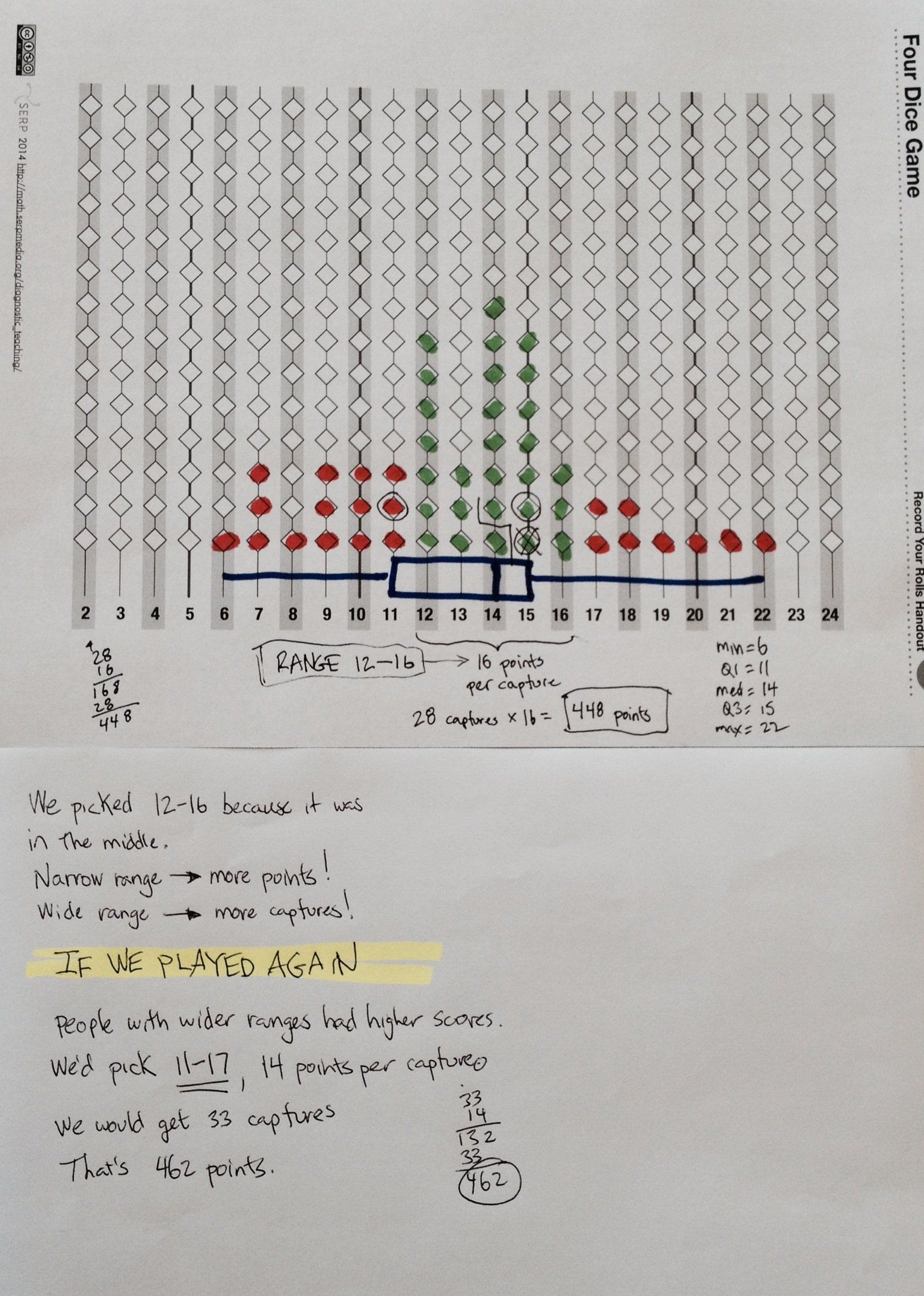
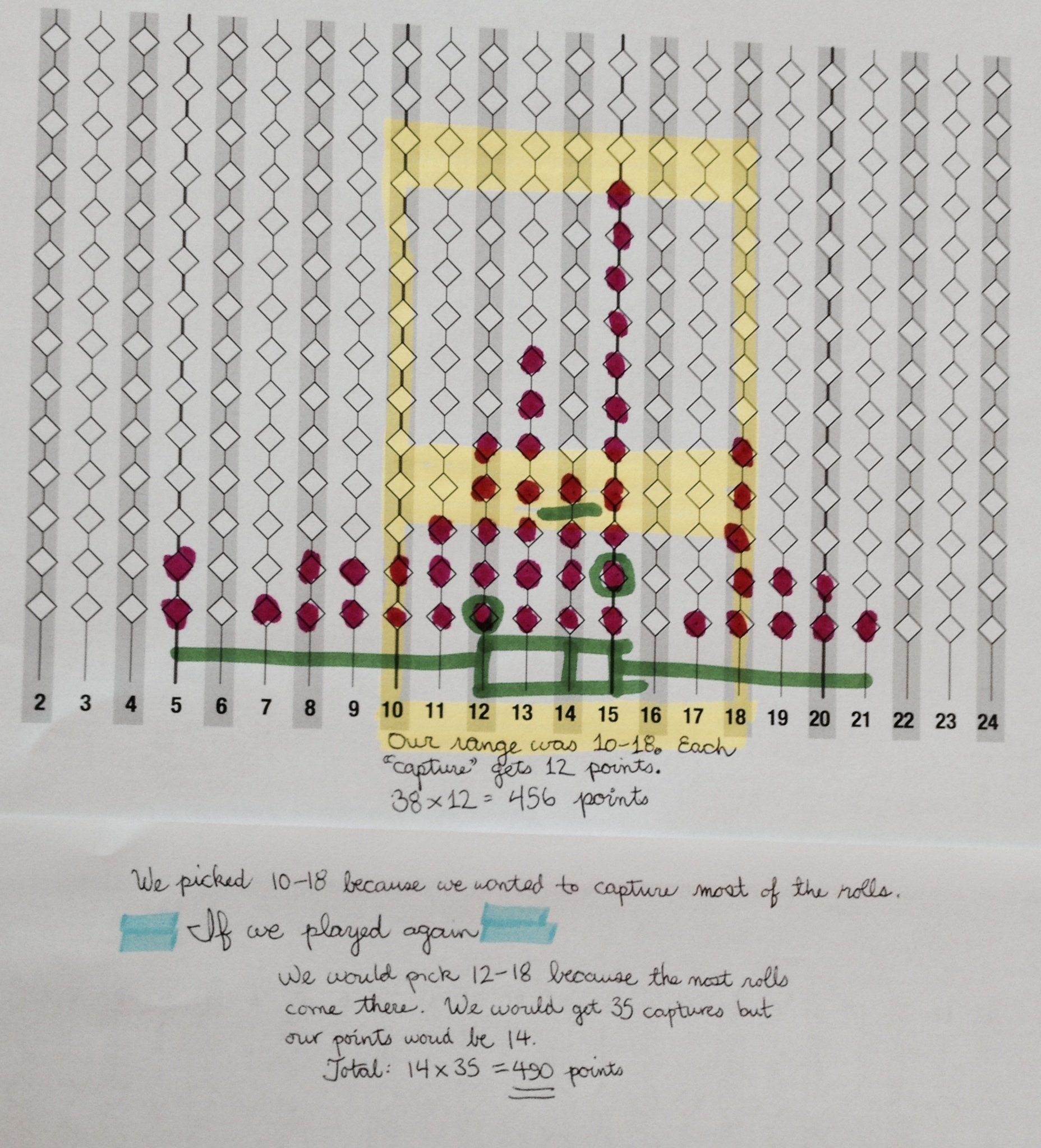
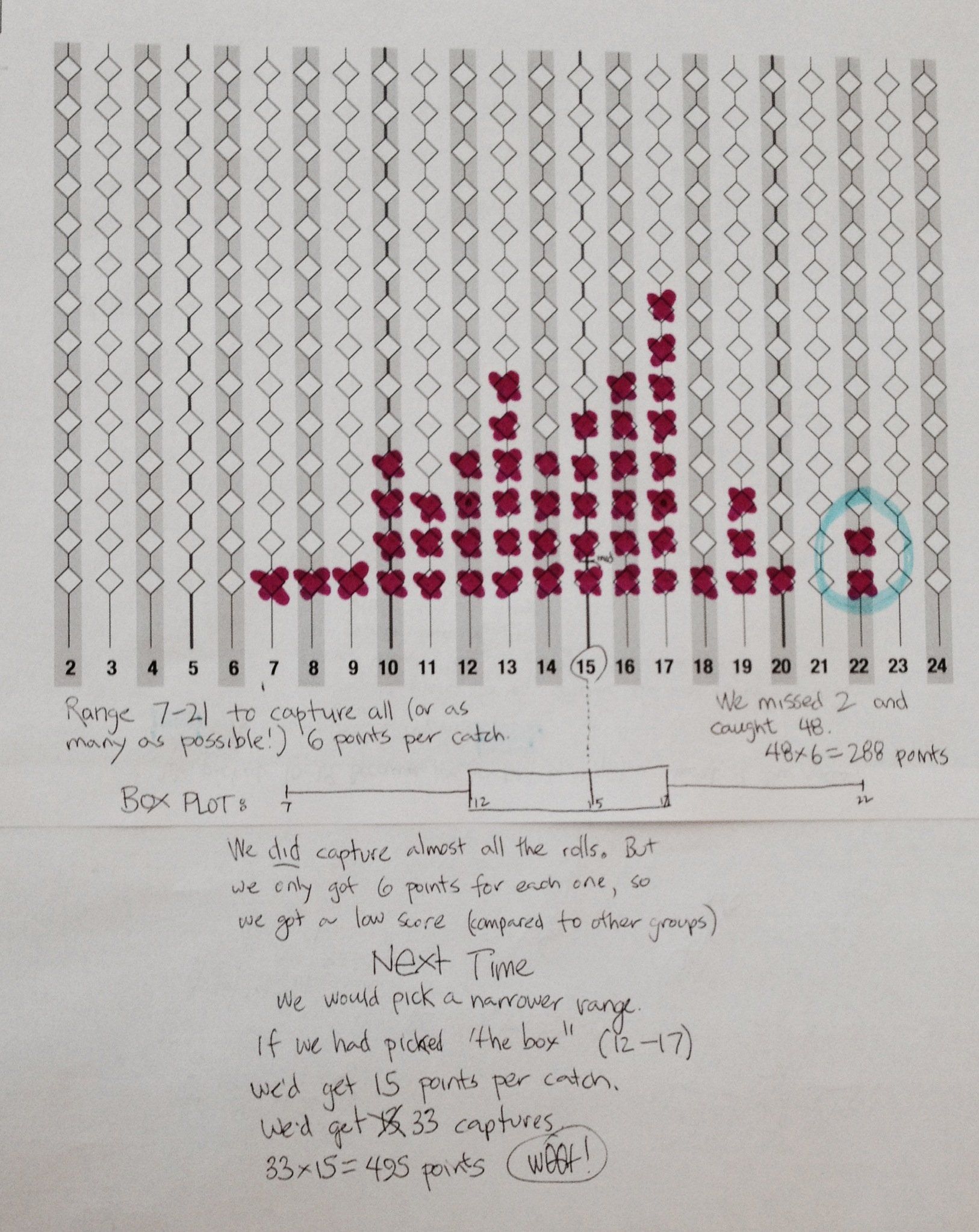
This is a little different from other poster problems in that after the class discussion, students amend their posters to say what range they would choose if they got to play the game again, and why.
Facilitate a discussion of the different approaches. Select a sequence of posters that will help students move from their current thinking (Levels 1–3) up to Level 4 or 5. Be sure to include, for example, a wide-range, low-scoring poster where the students were thoughtful but discovered through experience that a wide range results in many “captures” but a low score. If such a poster doesn’t exist, you can take anyone’s data and ask, “Suppose this group used a really wide range such as the 16 range (4 points per capture). How many points would they have gotten?” This models the idea of a “what-if” calculation, and is easy to do.
Level 1:
The group chooses a range by guessing, with little reference to data they collected before. The range may be off-center. (The center should be at 14, or close to it.)
Level 2:
Students choose the range of the box in the box plot, simply because it was the box. This may still be off-center.
Level 3:
Students deliberately center the range even though past data may have been off-center. They choose a range using the box or otherwise give a one-sided reason for the choice (e.g., we want to capture more or we want a higher score per capture), but do not explain the trade-off well.
Level 4:
Students center their range, which is between 4 and 10 wide (10–16 points per catch). Their score will probably be over 400. They clearly articulate the trade-off: you get fewer points per catch for a wide range, but you’ll capture more—so there’s a “sweet spot” in the middle where you get the most points.
Level 5:
Students use 4-dice data distribution to make “what-if” calculations: would they get more points if they had chosen a different range? They actually calculate these potential scores and adjust their range accordingly.
Questions to ask across presentations
- What’s the median value? How much does it vary from poster to poster? (Should be 13–15.)
- How can you use the box plot to help you decide on your range? How much does the box vary? (Look at the different box plots and compare. Note that the min and max will vary more than the quartiles.)
- If you picked the same range as the box in the box plot, how many would you catch? What would your score be? (You would catch a bit more than half—25 to 30 rolls. Why half? Because the box contains the middle half of the data. Score depends on the width of the box.)
- What range would you pick to be pretty sure of catching almost all of the rolls? (Wide, e.g., 6–22 or 4 points per catch)
- Why is that range a bad choice? (You catch them all, but it’s not enough points. 4 times 50 is only 200 points.)
- What is the trade-off in this game? (A wide range gets many catches but few points per catch. A narrow range gets a lot of points per catch, but not that many catches.)
- How did you use the data you collected before? The data could be from
The prediction you made during Step 2, based on rolling fewer dice, or, even better,
The distribution of sums of four dice you rolled before actually playing the game.
Focusing on Variability
Ask students to look at the distributions of rolls on all the posters.
- What’s the same about the distributions? What’s different? (They all have more in the middle and fewer on the ends, but the details vary widely.)
- Suppose we picked a simple range, like 10–15. (20 points per catch.) What are the different scores we would get with each of these sets of rolls? (Each group could calculate and report back. Scores should vary considerably.)
- So: how much of this game is luck, and how much is skill? (Lots of luck, but you have to pick a reasonable range in the middle. Some students may think there is more skill when they’re really only lucky.)
- Suppose we did 500 rolls instead of 50. How would the distribution change? What would the shape of the distribution be? (If there are 10 posters with graphs, consider adding them all up.)
Enhancing the posters
Now challenge the groups:
Seeing all the other data and the other groups’ posters, imagine you’re going to play the game again. What range would you choose, and why?
Write your range—the minimum and the maximum, and how many points you get for each capture—and your prediction for your score.
Then explain, clearly, why you chose the range you did.
(The instructions are on their sheet, Handout #3.)
Optional Contest
If there’s time (or if some students finish early, or if you want a homework task) you can give students Handout #6: Fifty More Rolls (or use Slide #1, which has the same graphic).
The handout has a record of 50 more rolls of four dice. They can calculate the score their new range would have gotten, and compare that to other groups’s scores with the same data.
Another challenge is to figure out what range would give the best score with that data.
6. FOCUS PROBLEM: Same Concept in a New Context
Orient the students to the context of the problem on Handout #5 by asking questions such as,
- Do any of you post pictures on Facebook or Instagram (or whatever site is currently popular)?
- How many pictures do you think a typical student posts?
Explain the problem from Handout #5, then pass it out.
Approaches and Solutions
You could make a dot plot or a box plot. In creating either, you will find the median and the first and third quartiles. In the illustration. Diane’s data (21 posts) is highlighted. (We made the graphs using Fathom. The box plot shows outliers as most computer displays do. Showing outliers is not not part of the Grade 7 standard.)

You’ll find that the median is 15 and the quartiles are 8 and 21. That is, Diana is sitting right at the third quartile: only a quarter of all students posted as many as she did. So is she typical? It’s a judgment call.
Students can look at the shape of the distribution—which is skewed to the right—with a few students posting many more pictures. Diana could argue that they’re the ones posting a lot; Diana is really just at the upper edge of most of the students.
Another (sneaky) strategy Diana could use is to calculate the mean, which is exactly 21, her very number. She can tell her mom that she posts the average number of pictures—but discussion should bring out that this is at least a little deceptive!
Project funding provided by The William and Flora Hewlett Foundation and S.D. Bechtel Jr. Foundation.

This work is licensed under a Creative Commons Attribution-NonCommercial-ShareAlike 4.0 International License.