
Dot Plots, Histograms, Box Plots, and Bar Charts. Which one to use?
These four graphs all display distributions of data, but they do it in different ways.
Dot Plot
To make a dot plot, start with an axis (a number line) and place a dot over each data value. The dots can be any symbol; students often use X’s. When you get a second data point at the same value, stack the points. These are relatively easy to make by hand, and you can get a pretty good qualitative idea about center and spread.
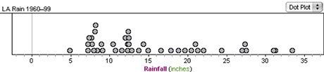
Annual rainfall in inches, Los Angeles, from 1960–1999
Histogram
To make a histogram, divide up the axis into bins (sometimes called “classes”) and make a rectangle for each bin whose height is proportional to the number of data points in the bin. These are devilishly hard to make by hand, and they look somewhat different depending on your choice of bin size and position. But for large numbers of data points, they give you a clear idea about the shape of a distribution.
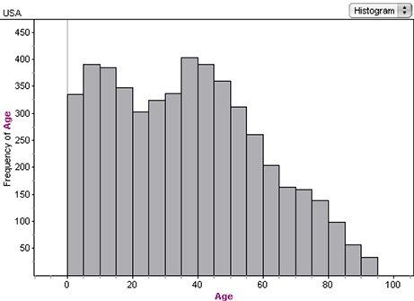
Ages of 5000 Americans from the 2000 Census. See the baby boom and its echo?
Box Plot
A box plot is a visual picture of a distribution using the five-number summary: the minimum, the first quartile (a.k.a. Q1), the median, the third quartile (Q3) and the maximum. Because they are simple diagrams, students can make box plots by hand. Box plots are particularly good for comparing two distributions: when students see two or more box plots in parallel, they can easily see the differences between groups.
For more details on making a box plot, see this "tune-up" on the subject.
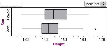
Heights in centimeters of 153 11-year-olds. The girls are a little taller than the boys.
The hard part about making a box plot is putting the data in order so you can find the median and the quartiles. But notice that if you make a dot plot first, it becomes easy: just count the dots from each end.
You can look at different types of graphs in terms of how much of the data they actually show. The dot plot shows all of it: every value appears individually. Our age histogram groups the data into 19 classes, so it distills 5000 numbers down to only 19. The box plot goes further, reducing the numbers to five.
This reduction in numbers does not mean that the dot plot is better or worse than the rest. Rather, each graph has its place and its limitations.
Bar Chart
Bar charts are often confused with histograms. Students do not need to understand the distinction at this stage, but you need to know the following.
A bar chart shows the distribution of categorical data. All of our examples above were of numerical, quantitative data: the numbers have a place on a number line, and they have an inherent order. They are also continuous; it’s possible to be 163.47 cm tall or 34.5 years old.
Let’s get an example. Census at School (http://www.amstat.org/censusatschool) asks for a favorite superpower. Below are 410 responses from US sixth and seventh graders.
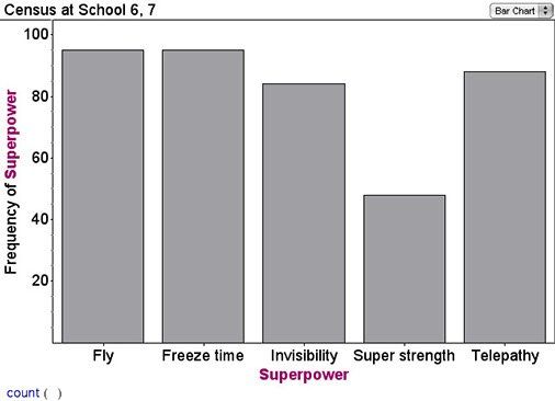
This variable (Superpower) is categorical, not numerical. The values are words, not numbers. They divide the people into distinct categories rather than ordering them by a number. Another way of thinking about it: you can’t be “Fly and a half.” It doesn’t make sense.
We bring this up because if your data has only a few different numbers in it (but possibly repeated many times), you can treat the numbers as if they were categories. Here are a histogram and a bar chart for the results from 50 rolls of two dice:
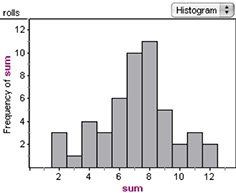
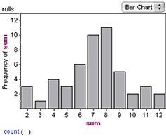
They look pretty much the same, except that the bars in the bar chart have space between them. Why does this matter? Because in this case, the bar chart (or the histogram) is easy to make and it retains all of the data.