
Mathematical Diagrams
A Closer Look at Mathematical (and not so mathematical) Diagrams
A diagram of a problem situation in mathematics shows where the numbers come from. Numbers can be known, unknown, or variables (sets of numbers). For example:
We are pouring water into a water tank. 5/6 liter of water is being poured every 2/3 minute.
How many liters of water will have been poured after one minute?
How many liters of water will have been poured after one minute?
Where are the numbers going to come from? Not from “water tanks.” You change to gas tanks, swimming pools, or catfish ponds without changing the meaning of the word problem. All of the numbers referred to (given, implied or asked about) come from:
- The number of liters poured
- The number of minutes spent pouring
- The rate of pouring (which relates liters to minutes)
A diagram should show where each of these numbers comes from. We need a way to show liters and a way to show minutes. Examples of diagrams for this situation shown.
The examples range in abstractness. The least abstract strategy (Level1) is not a good reasoning tool because it fails to show where the numbers come from. The more abstract examples are easier to reason with, if the student can make sense of them. Our goal is to teach students to make sense of, produce, and reason with abstract diagrams that show all the numbers and their relationships. A good practice is to first make a more concrete diagram in early sense-making, then revise it to a more abstract diagram for reasoning purposes.
Level 1
This picture shows the objects of the context without showing where the numbers come from (thus, this is not a useful diagram for a mathematics class). A clock is a poor representation of elapsed time, as it only shows current time. The problem is about elapsed time.

Level 2
This diagram shows the numbers as properties of pictures. The relationship between time and liters is not shown. A timeline is much better than a clock for elapsed time.
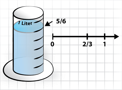
Level 3
This diagram lines up the liters with the minutes in a valid way. The tank still looks like a tank. Students might draw a diagram like this and invalidly line up the 1 mark on the liters with the 1 mark on the timeline. If they don’t line anything up, they are not ‘relating’ the variables in their reasoning. The picture of the tank makes it hard to see "0" liters and so hard to realize they line up.

Level 4
This is a diagram that abstracts both variables to a single number line. This makes reasoning about the relationship much easier. Another version of this is two parallel lines lined up correctly (see number strips from Singapore). In either version, these are number lines.
Why the "1s" don't line up:
Each number line has a "1", 1 liter and 1 minute. It is valuable for students to understand the "1" on the liter line and the "1" on the second line. Why are the 1s where they are? The two lines are constructed based on the given relationship: 5/6 of 1 liter in 2/3 of 1 minute. 5/6 liter lines up with 2/3 minutes. "0" liters lines up with "0" minutes. The point on the liter line that lines up with the 1 minute shows how many liters per minute, the "unit rate".

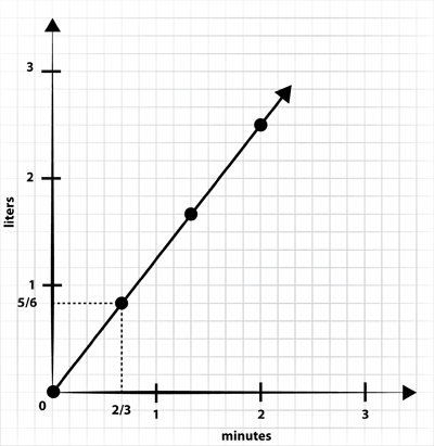
Level 5
The coordinate graph shows even more about the relationship between the variables. It shows the rate as the slope of the graph. This is the most mature diagram and a set of mathematical proficiencies and knowledge in its own right. We need to teach kids how to reason with graphs, not just interpret them. Use the graph to answer questions like: How many liters per minute? How long to pour 10 liters?
SERP has been supported to conduct this work by the S.D. Bechtel, Jr. Foundation.

This work is licensed under a Creative Commons Attribution-NonCommercial-ShareAlike 4.0 International License.